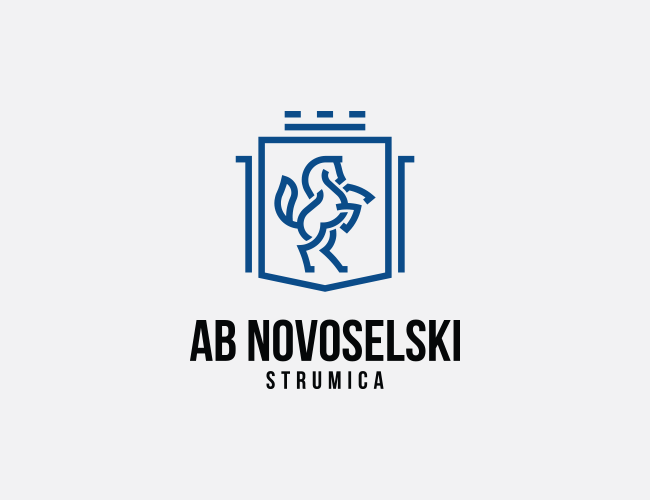
Like people, companies change over time and when they do, a brand redesign becomes necessary. Because our business has expanded and changed, we made a small refreshing to our visual identity. Our logo is still made of both graphic symbol and typography.
We kept our graphic symbol, horse on a crest, and made small changes on it to make it look more modern and powerful. The graphic symbol is now made with daring, strong and precise lines. Horses are majestic, fast, powerful animals that also have close historical connection with human transportation and development, as is our company. The top of the crest is upgraded with small graphic element that presents a historical building in the city where the company is founded. The typography is also refreshed. Our company’s name is now written with new sans-serif font. Our color palette has reduced from 3 colors to 2 colors, blue and black.
